Remember when you woke up one morning to discover that you had the new Facebook Timeline?
It’s about to happen again – a brand new look and interface on Facebook. A whole new world to navigate and get used to. And one with countless opportunities for your business page.
So don’t be taken by surprised. Unlike with the timeline, this time, you can start early and be ready to capitalize on this NEWsfeed before it is widely available!
So what can you expect from the new Facebook?
1. A more personalized Newsfeed.
2. Photos and Visual Content Reign
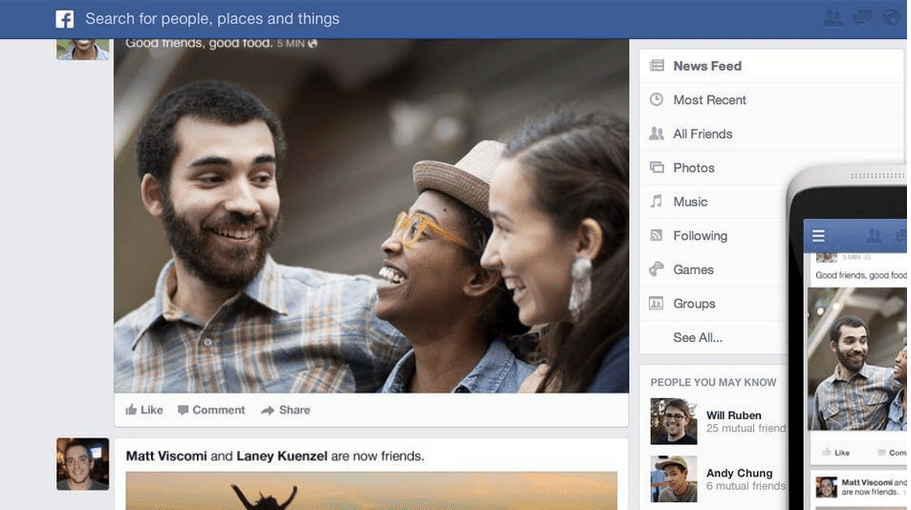
The new look is designed with mobile users in mind. Images will be larger and when a user “likes” you or something you post, your image will show up on the Newsfeed.
In general, the stories are bigger now. By placing text on photos, Facebook has created more space for visual content and thumbnail images.
3. Content Organized by Genre
- On the top right, you will be able to view content by selecting topic feeds, such as “Photos,” “Music” or users following a certain page.
- You can also select more specific categories such as “New Cover Photos.”
- This is particularly exciting for users who frequently get to the end of their Newsfeed. Once you have scrolled to the bottom, you will have the option to change your view from photos to videos or music. This will open up a whole new way of scanning your Newsfeed and keep users on Facebook longer.
4. Sidebars
The new black sidebar on the left looks sleep and modern – and will now include your chat. The bar will also often be minimized to show only bookmark icons for friends’ faces.
5. Content for any Device
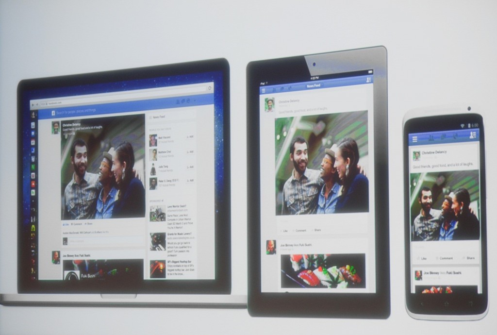
The new design is meant to be friendly to all kinds of devices – from cell phones to iPads to desktop computers; the new Newsfeed should offer the same user experience throughout.
Figure 1 Photo by Alex Washburn/Wired http://www.wired.com/business/2013/03/facebook-news-feed-overhaul/
And for those of you out there who are wondering just WHY Facebook is doing this, here is the long and short of it:
Facebook wants to offer a new, modern look that is free of clutter. But at the end of the day, the new design is meant to be more addictive and keep users perusing longer.
By lengthening our Facebook-attention spans (no easy feat in today’s AD-saturated world), Facebook is offering more opportunities for advertisers.
So what does this mean for a business owner?
- Every minute we spend on Facebook creates more advertising real estate – more opportunities for the ones paying Facebook’s bills to try and sell us something. As a business owner – this is where your ears should really perk up! More users spending more time on Facebook means a big opportunity for you!
- The new Newsfeeds will highlight your Business Facebook Page’s most popular posts! This is an amazing way for you to increase your followers, likes, comments and shares.
- When a Facebook user “likes” your page – YOUR cover photo and profile photo will show up in Newsfeeds – great free advertising for you!
- The Following Feed – This new feed will show users what is new in the Pages they follow. Users will have more exposure to Pages and will easily be able to view your updates alongside friends’ updates, rather than instead of them.
- Because the new design is meant to offer the same user experience on all devices, your potential customers and followers will be more likely to keep up with your page, regardless of whether they are on their home computer, iPad, or iPhone.
Want to join the party early?
Here’s what to look for: Facebook is kind enough to be unveiling the new look slowly.
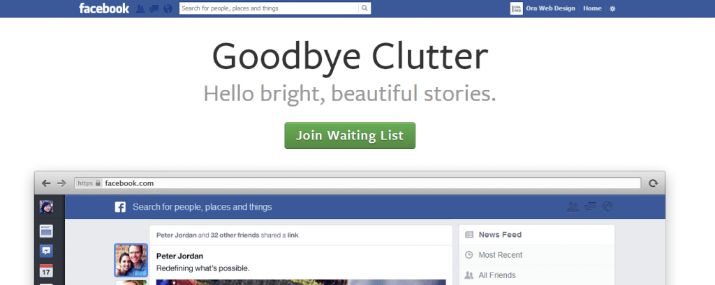
It won’t happen overnight, so you will have time to get used to it, and the guys at Facebook will have a chance to integrate user feedback. If you want to be an early adopter, you can look for a banner that says “Coming Soon: Less Clutter, More Stories.” You will have the option to click on this and try out the new look.
Or Click here: https://www.facebook.com/about/newsfeed and sign up for the waiting list!
Inquiring Minds Want To Know…What Do You Think?
- How will Facebook’s new look affect the way we advertise on Facebook?
- Have you tried the new Facebook Newsfeed? What do you think! Be one of the first to weigh in!
About Author
Kim Garst
Kim Garst is a renowned marketing strategist and speaker who is trailblazing the use of artificial intelligence in digital marketing. With over 30 years of experience as an online entrepreneur, Kim helps entrepreneurs grow their business and authority online by using AI technology. She is leading the way with proven AI frameworks that help entrepreneurs build authority in their space.
She is keynote speaker and an international best-selling author of Will The Real You Please Stand Up, Show Up, Be Authentic and Prosper in Social Media.
Named by Forbes as a Top 10 Social Media Power Influencer, Kim is well-known for her skill to simplify complex technology and make the use of AI understandable for business growth. Her relatable, actionable advice helps guide new entrepreneurs to harness the power of AI to succeed in digital marketing. Kim is leading the way in combining human and technological skills to create a new model for AI-powered marketing.


11 thoughts on “Facebook’s NEWsfeed – How to Optimize the New Look for Your Business”
4. Sidebars. The new black sidebar on the left looks sleep and modern – and will now include your chat. The bar will also often be minimized to show only bookmark icons for friends’ faces.
Looks like a typo 😉 Thanks Joanne!
I agree, Gary. I am anxiously awaiting for my profiles to make the ‘switch’ 🙂
I can’t wait to actually see this in action!
Same here, Dawn 😉
Others sharing your content is definitely the big picture goal!
I am with you on the larger images! Can’t wait.
Yes, I am definitely looking forward to the new look.
Good stuff Kim.. Hoping to get this new News Feed soon!
I am glad that social media platforms realizing that less is more. Too much clutter makes it hard to focus and get anything out of it.
Yes it does!Thanks for stopping by Jutta!