Have you ever posted a graphic to Facebook and absolutely nailed it?
High engagement, lots of comments and shares. Wouldn’t it be amazing if you could get that same effect every time you posted online?
Graphics are hot stuff on social media. The best brands understand how to use visuals with their Facebook posts. More than 60% of social media is now made up of pictures because there are a bunch of techniques that you can use to create images that look great and stand out.
Before we dive into it, here are a few things to consider when it comes to the secret to great Facebook graphics:
- Your brand assets. What brand assets do you have available? Do you have a logo you can use in all your posts? If you’re a clothing store, do you have product photos of all your inventory? As a cafe, you might have photos that customers have taken because doing an inventory ‘stocktake’ will help plan your visual strategy.
- Brand voice and visual style. Who are you talking to? Is your brand young and hip, or reflective and inspirational? Knowing the answer will guide the type of visuals you use. Would high res photographs work best or are quick smartphone snaps a better fit?
- Point of difference. You’re not the only brand on Facebook. There are millions of brands across thousands of industries. What will you do to be different? This could be the graphics you post, icons you use or the way you share your content. What’s your point of difference?
1. Use Grids and Frames
When it comes to photos, there’s one thing to remember. Well, actually two: grids and frames. These are your best friend so photos should always be contained in a grid or frame. It makes your designs look so much more professional and also gives some order to your design.
It’s much easier to add text over the top of a grid. A simple text holder doesn’t go astray, and this can make for a simple Facebook post or blog title graphic which you can share on Facebook.
2. Photo Filters
Filters can be used for more than that selfie you just posted to Instagram. They’re being used by well-known brands to great success. The reason? They add consistency to your graphics and a big plus on social media.
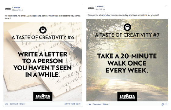
Want to use an image in the background for your post? Try adding a filter like Lavazza has done in the Facebook graphics below. The washed-out photos contrast with the text, making for a simple yet compelling graphic.
Brands can even craft a filter that matches their personality. By applying a filter to the images of surfers below, we’ve made the photos look more consistent and applied the same visual style to each photograph. You can do this for all your posts, or posts within a particular series. For example, a special promotion or a regular weekly Facebook post.
For a simple Facebook graphics post idea, try coupling quotes with a filtered image and your logo. It’s easy to do and yet looks great. Simply change the image or text and you have a consistent template that looks great.
In the quotes above, all that we’ve changed is the image in the background, the text and the colors. Super easy and yet super effective.
3. Use Your Brand Assets
Don’t complicate your visual content because simple is always best. A great template with your logo or a consistent icon can go a long way.
Etihad posts a graphic each week as part of its #MONDAYMOMENTS promotion. By posting a new special for a different destination each week, the company builds visual consistency. It uses stunning images from its many destinations, providing travel ideas to its followers. It’s a simple yet effective template and who doesn’t love a dreamy travel photo?
Try it yourself. Mix your logo, text, icons, color and frames to create templates for different post types. You don’t have to complicate things and just use the graphics you already have on-hand.
For cafes, restaurants and bars, a simple Instagram may surface photos your customers have taken. so why not ask permission to use them on your social media pages? Those are great visual content ready to be used.
4. Be Creative
There are lots of ways to build brand consistency through your posts. Sneaker company CLAE uses color cleverly on its Facebook page. The brand’s most recent season of shoes are displayed in different arrangements on a blue background. Because of this, you recognize the brand’s posts when they appear in the News Feed.
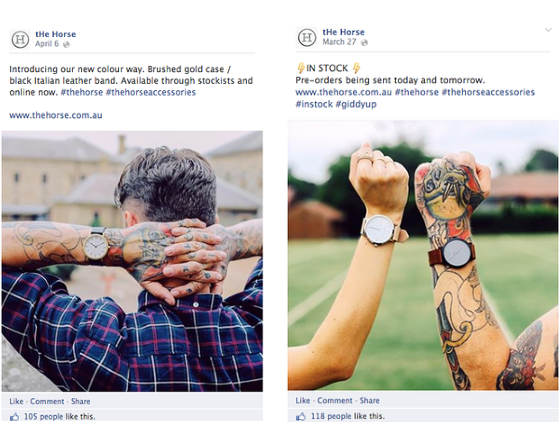
Another fun idea is to pick consistent images. Australian brand The Horse has been promoting its range of watches. It posts new photos of different types of people wearing the watches each day. Different people in different places and all wearing the brand’s watches.
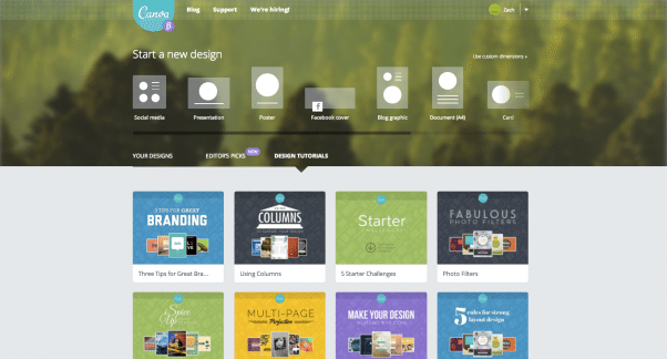
Using consistent imagery builds a visual rapport with your followers because they know what to expect and at Canva, we use a consistent style for all our graphic design design tutorials.
You’ll notice that when we share the cover graphics on social media they have a consistent style. The colors are changed but the logo and same patterned background remains.
The same branding carries across to our weekly emails. Picking a theme and sticking to it builds consistency. Think about how your brand can carry across all your marketing channels.
Conclusion
When it comes to visual content, consistency is the key so try implementing some of these ideas on your own page. Get creative and put the content you have to good use. There are so many great ways to mix and match your graphics to produce truly engaging Facebook graphics.
Remember to use grids and frames and apply consistent photo filters, always use your logo and be creative in your approach.
There you have it! The Secret to Great Facebook Graphics…
Need more ideas on what to post in Facebook? Check out my other post:
17 Killer Facebook Post Ideas For Small Business Owners
Have you thought about your visual branding for Facebook? How has it changed your social media strategy? Share your experience below.
About Author
Kim Garst
Kim Garst is a renowned marketing strategist and speaker who is trailblazing the use of artificial intelligence in digital marketing. With over 30 years of experience as an online entrepreneur, Kim helps entrepreneurs grow their business and authority online by using AI technology. She is leading the way with proven AI frameworks that help entrepreneurs build authority in their space.
She is keynote speaker and an international best-selling author of Will The Real You Please Stand Up, Show Up, Be Authentic and Prosper in Social Media.
Named by Forbes as a Top 10 Social Media Power Influencer, Kim is well-known for her skill to simplify complex technology and make the use of AI understandable for business growth. Her relatable, actionable advice helps guide new entrepreneurs to harness the power of AI to succeed in digital marketing. Kim is leading the way in combining human and technological skills to create a new model for AI-powered marketing.







30 thoughts on “The Secret to Great Facebook Graphics”
Good advice! I am going to check Canva out today.
Blair,
That is great to hear… We can’t wait to see what you come up with. 😎 Boom Care Squad – Aida
Great article. I’m guessing that CANVA’s features can pull off these techniques.
Thanks for reading John. Yep, you’ll have to give Canva a try and let me know what you think!
Zach, you know how we feel about Canva. It’s great and there are so many great features. – Boom Care Squad – Aida
Great article ! I work at FuturOn, a digital marketing agency, and I will keep these tips in mind while creating facebook graphics . Thank You
Marushka,
Thank you of much… hopefully you will be able to put those tips to good use. Boom Care Squad – Aida
Some good stuff here, but I would question the idea that photos should always be in a grid or a frame. Have seen many great frame-less images, and sometimes over-designing can make images look more like advertising and less natural (depending on the brand and circumstance). Grids do not play well on cell phones…have seen so many where you couldn’t tell at all what was going on in the images.
Great ideas and Canva looks like the perfect tool for accomplishing this. Thanks!
You will love it 🙂
I just published a blog post using Canva for the first time loooove it. It’s really fun to use. Thanks for these tips!
Willesha,
We are so glad you are enjoying Canva, we think it is a great tool as well! We can’t wait to see what you are able to create with it in the future. The more you use it, the better it gets – Boom Care Squad – Aida
I love using Canva for my social media marketing. My clients are typically found on LinkedIn so my posts and photos get more reach when shared by my connections.
That is great news, Alicia. Canva, really is an awesome tool, and it is great to hear how you have been able to use it. It really does allow you to build some great graphics. – Boom Care Squad – Aida
Jennifer.. thank you so much! I am so thankful that you shared your feedback with us, and that you enjoyed the article. -Boom Care Squad – Aida
Jennifer
Thank you so much for letting us know that you are enjoying the articles. We really appreciate hearing from you. Boom Care Squad – Aida
Canva or some phone apps like Wordswag.
I love depositphotos.com
I always see to it that I have this sort of consistency that would suit my brand signature. In that case, everything they see my photos they’d think it’s really mine.
The “grids and frames” section (& accompanying graphics) added very little to my knowledge of grids and frames. Sorry. (The rest of the article is great.)
Good stuff to read.Photo editing do play role in grabbing attention. It is like doing makeup before going into public.
Yep 🙂
Wow amazing i have never seen this kind of content before it is amazing and wonderful the same time. THANKS it was really helpful. You can also check mine too https://www.makeoverarena.com/waptrick-games-videos-mp3-download-www-waptrick-com/
nice information for a new blogger…it is really helpful
interesting content and also its well understandable
interesting article
I have been on the internet lately, looking for something to read and that is how I came across your site and saw this article of yours. So, I decided to see what it says and I find out that it is so amazing. You really did a great work in on your site
Wonderful site.
Lots of helpful info here. I am sending it to some friends ans additionally sharing
in delicious. And of course, thanks for your sweat!
What an amazing write, after searching on the internet finally got what i’m looking for.
Thanks very very much. Keep up the good work your doing here.